


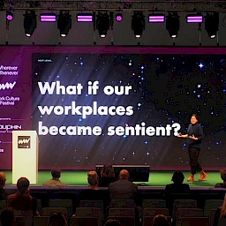
 IBA editorial team
 During the Work Culture Festival, Dr Axel Buether also gave a presentation on colour and lighting design in which he explained the effects colour and light have on human experience and behaviour, motivation at work and health. His findings, which are based on extensive research on the topic of colour psychology, show how a targeted colour design can be used to optimize work environments.
Colour as the strongest communication system
Colours are a central element of human perception and their effects are experienced on the emotional, cognitive and physiological levels. Colours can be used for aesthetic purposes, but they also have an effect on certain fundamental biological functions. For example, colours make it easier for us to get our bearings in a new location, support non-verbal communication and have a direct impact on our feeling of well-being. Looking at and processing colours takes up a large amount of the capacity of our brains, and this mental activity occurs more rapidly than many other cognitive processes. Only fractions of a second after entering a room, a person will begin subconsciously evaluating the surroundings, and this assessment is largely influenced by the colours they see. This effect occurs before a rational consideration of the surroundings begins, and it partly determines whether a room or space is perceived as pleasant, stimulating or unpleasant. In this sense, colours function as an efficient communication system that influences expectations and conveys social and spatial information. Colours shape our behaviour in a subtle way without us always realising it as we go about our day.
The evolution of colour perception
People’s perception of colour is the result of a long evolutionary process of adaptation that developed from the need for humans to get their bearings in a complex environment and be able to recognise vital information necessary for survival. Whereas some types of animals are colour-blind and can survive without the ability to see colours, others use colours in a targeted manner for communication or camouflage, or when choosing a mate. In the case of humans, trichromacy—the presence of three receptors in the retina that are sensitive to different wavelengths—enables people to distinguish between a broad range of colours and hues. Of particular importance here is the sensitivity in the medium wavelength range (green), as green areas were the primary habitats for humans for millions of years. Colours such as blue or green send a message to us of stability and security, while warm hues such as red or orange make us more alert when we see them, as they indicate and emphasize potentially important stimuli.
Colours also played a functional role in nature in the early days of plant and animal evolution. For example, plants used colours to adjust to lighting conditions and animals developed different colours and patterns for orientation, species recognition and warnings. These evolutionary mechanisms explain why colours continue to have a powerful effect on perception and human behaviour today. Colour perception is thus not only an aesthetic phenomenon but also, and more importantly, a type of biological communication system that has a sustained impact on orientation, emotions and behaviour—all of which are relevant in modern work environments as well. Once these mechanisms are clearly understood, it becomes possible to use colours in a targeted manner to ensure that along with the functional role they play, they also have an emotional and psychological impact in the workplace context.
Colours as an instrument for influencing behaviour
In his presentation, Buether showed that colours can be used in a way that influences perception and behaviour in interior spaces. An unsuitable selection of colours can make it more likely that people will feel restless or stressed, while a coordinated colour design can promote concentration, social interaction and a subjective feeling of well-being. With regard to offices, cool and muted blue shades are often associated with focused work, while warmer shades tend to support communicative and creative processes. In other words, colours not only have an implicit effect; they also shape expectations as regards corporate culture and the climate in the workplace. Buether explained the possible effects here by referencing a project that was conducted in a clinical setting: after the colour and lighting design in an intensive care unit was changed, the use of certain medications declined by approximately 30%, while the number of sick days taken by staff fell by around 35% and reported feelings of well-being increased by approximately 44%. These results indicate that different colour designs can demonstrate measurable correlations with psychological and physical parameters in the given context.
Colours can also be used to create different functional zones, especially in open-plan offices. Areas for focused work are often designed with cooler and reserved colours, while conference rooms and interaction zones might be marked by warmer activating colours. Accent colours support orientation, highlight functional areas and facilitate intuitive navigation. Conversely, a monotone or an unfavourable choice of colour can lead to disinterest, fatigue or a heightened feeling of irritation. Although the effects reported from the ICU project cannot be transferred one-to-one, they do provide indications of how carefully designed colour and lighting atmospheres can increase job satisfaction and reduce stress, and thus create conditions in the office that promote employee health.
Colours in the office: more than just aesthetics
A functional colour design is very important in the work environment. As Buether emphasized, the point is not to make rooms and spaces as colourful as possible but instead to use colours in a purposeful manner in order to support various types of activities. Several specific application examples for the business context are given below:
Promoting concentration: bright cool colours such as blue and green are suitable for workstations and spaces where focused work is required. These colours have a calming effect, decrease stress levels and increase cognitive performance.
Boosting creativity: warm colours such as yellow and orange stimulate the power of imagination and promote communication. These colours can create an inspiring environment in conference rooms and creative areas especially.
Relaxation and regeneration: subdued, earthy hues support relaxation processes and offer a counterpoint to colour schemes that are designed to enhance performance. Quiet zones for relaxation and lounge areas can especially benefit from the use of such hues, as they help reduce stress.
Team dynamics and identity: uniform colour concepts with accents in a company’s colours can strengthen identification with the company and create a harmonious atmosphere.
Zoning and orientation: colour-differentiated zones facilitate spatial orientation and help employees navigate through an office intuitively. Colour differentiation can be used, for example, to visually distinguish work zones from communication zones.
Interplay of color and light
Lighting is also a key factor, as light tends to either reinforce or weaken the effects of colour. The colour temperature of lighting influences not only visual perception but also the release of hormones—and thus factors such as alertness, motivation and relaxation. Cool lighting that is similar to natural daylight promotes attentiveness and performance, while warmer lighting conveys a feeling of comfort and security and supports regeneration processes. The decisive factor is the interplay between colour and light, however, as it is only through the combination of the two that one can create a consistent spatial effect that purposefully supports certain activities while also strengthening feelings of well-being. Particularly effective here is the use of a dynamic lighting approach that adjusts lighting in line with the natural rhythm in which a day proceeds. When combined with coordinated colour concepts, such a lighting approach will create a work environment that has an activating effect during the day and a calming and relaxing effect during breaks and in the evening.
In other words, the goal is to achieve a balance between stimulating and calming elements in order to ensure employees will become more productive and satisfied, and remain so over the long term. Such an environment can be created with the help of evidence-based colour psychology and a targeted lighting design.
