


 Christiane Scharpf
 The manufacturers of kitchens and bedrooms, the office furniture industry and the organizers of the major furnishing and interior design fairs imm and Orgatec all looked to Interzum in Cologne this May, where they were offered an abundance of trends and themes for their products.
In addition to the approximately 1,600 exhibitors at Interzum 2023, expert speakers presented information each day on important developments and future topics relating to furniture, materials and colours in future furnishings: “The Trend Stage has high standards in terms of its topics and content. We want to paint a comprehensive and forward-looking picture of the industry,” says Katrin de Louw of the TRENDFILTER® company, curator of the Interzum 2023 Trend Stage.
Contribute to a World in Peace
Representing the industry, Renolit, a manufacturer of high-quality plastic films, presented colour trends especially devised in-house. Three colour collages, identified as the essence of the cooperation with various international colour institutes, were presented by Renolit under the title “Contribute to a World in Peace.”
The wish for a world at peace by means of colour compositions initially seems somewhat unusual, but could already be observed as a theme in the trend statement of the NCS colour institute for 2024+.
With its first trend, Renolit (“Contribute to your own awareness”) showed a delicate, warm four-tone colour palette that helps people focus on their inner consciousness. The second featured four loud (“Contribute to collective care”), rather saturated colours aiming to create a sense of community, while contemplation of the third trend, which consists of natural tones, is intended to create a healthy atmosphere (“Contribute to healthy environment”).

While touring the trade fair, it was noticeable that the day of bright, chromatic colours has also dawned for furniture manufacturing suppliers and interior design. Vibrant, mostly monochromatic colours are emerging from the digital world and increasingly manifesting themselves in fashion, makeup and product design. These are flanked by new “non-colourful” achromatic compositions, which, however, are derived less from black and white tones and more from brown-beige natural colours and as material are allowed to appear untreated and raw.
NCS describes exactly this dichotomy as a kind of split perception of our needs — a time of being torn between action and escape.
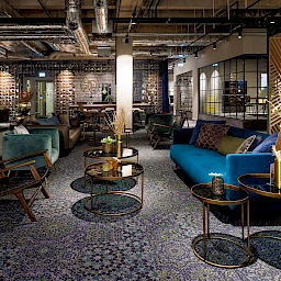
Exactly these antithetical colour worlds were presented at Interzum: On the one hand there were soft, warm rose and earth tones that can generate energy and dynamism in rooms. This was contrasted by intense, cool blue tones for a vivid yet relaxed atmosphere.
The two red-blue worlds were complemented by light to medium brown wood. With its natural look, it is particularly attractive for authentic living and working environments and characterizes many new decors and surfaces.

Colour as a structuring element
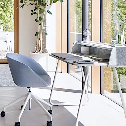
In future, working and living environments will continue to merge in terms of design—the workplace at home must fit in with the living area, and it’s not only Generation Z that expects a significantly more emotional design in the office building. The choice of colours can make an important contribution here. Well thought-out and, above all, carefully composed colour environments can help people concentrate and relax in equal measure. In particular, collaged colour design within one colour world with differentiated nuances has developed as an extravagant yet harmonious style element in interior design.
This was also seen in spring 2023 during a cooperative venture between the Swedish fashion chain H&M (Home) and the American colour professionals from Pantone (H&M loves Pantone). Two colour collections in similar contrasting warm-cold tones as they were also on display in Cologne. Here, products in red-orange-apricot and in green-petrol-mid blue form the basis for a chromatic and at the same time quietly elegant room design.

Sustainability: new materials in trendy colours
The three trend forums at Interzum, first and foremost Materials & Nature, showcased technologies and products with high resource efficiency, circular recyclability of the materials used and the reduction of CO2 emissions in manufacturing. Fabrics made from yarns woven from recycled marine waste or bast fibres, or an organic putty made from food industry waste — these examples of alternative basic products are also presented in the trend colour sky blue.
Manufacturers are also focusing on sustainability, of course: With the trend concept “free space”, the surface specialist Schattdecor offered new, environmentally friendly decors such as the recycled film Fineflex, which is suitable for use in the kitchen and bathroom thanks to its optimal moisture resistance.
There was much to admire and touch in the surface design of mainly light-coloured woods. Panels for furniture, walls or floors were slotted, lamellar, fluted or combined with felt.
Some tried-and-true timeless marble designs in white, beige and anthracite complement the new colours perfectly, as do new, bold decors with exuberant floral designs.

Interzum 2023 had a lot of new things to offer and at the same time was able to bring together already recognizable trends. The furniture industry has been given fresh ideas, colours and materials that will adorn products and give new perspectives to rooms in the coming years.

Christiane Scharpf founded CS Designberatung in 2006. After studying interior design, previous stations in her professional development included jobs in planning and sales as well as in brand consulting. She is a partner for 2D and 3D design as well as a strategic planning consultant for design projects at companies. She also works as a freelance journalist. Colour is a thematic focus of her work.
All collages in this post were created by the author. For this, she used photographs by Christiane Scharpf, images from the companies Pulpo Möbel, Ballerina Küchen and Arpa (colour trends at Interzum) as well as H&M (cooperation with Pantone) or Europlac and Schattendecor (material trends at Interzum).
