


 IBA editorial team
 Colours are a popular creative tool. They have an unconscious effect on human interaction and have the power to change the message of spaces. Used wisely, colours improve brain performance and boost productivity as well as creativity in the office. We have taken a look at the trend colours of this and the coming years, as they not only influence the catwalks of this world, but are also a source of inspiration for office interiors, occasionally in a slightly modified form.
“The choice of colour should not be left to chance. One should consciously choose a colour. Colours have a meaning and a function.” Verner Panton
The Trend Colours 2022
Which colours are in vogue is subject to many influences. Textile and fashion manufacturers not only rely on the ideas of their designers, but also employ trend scouts who travel around the world to pick up impulses and ideas “from the street”. An entire industry has developed from this. A charming by-product is the selection of the colour of the year, or more precisely, the colours of the year. Because scouts are not always in total agreement on where the journey is heading. This year has been no exception. While the colour experts of the Pantone Color Institute chose “Very Peri”, a blue with touches of violet, as this year’s colour of the year, the British trend forecasting company WGSN opted for “Orchid Flower” and with it a clear hint of reddish violet.
In the end, however, colour trends are not based on a single colour anyway, but on the interplay of different colour systems. The VIEW magazines, which specialise in fashion and colour, are dedicated to these. This year their colour collection is more exciting, lively and colourful than in previous years. Other current trend colours range from anthracite and citrus to beige, pink and blue:
- Non-black: Black, a timeless colour that stands for longevity and durability, takes a back seat to the so-called non-blacks in 2022. The dark greys and browns serve as the base colour and can be complemented well with striking accent colours.
- Softened citrus: Orange remains an important colour in 2022. The palette of citrus shades ranges from bright and strong coral tones to tangerine and pastel peach to strong yellow. Citrus colours highlight and work well with Non-Blacks or soft beige tones.
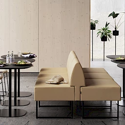
- Gentle Beiges: Natural off-whites are an important base colour in 2022. The neutral base colour shades range from delicate, barely-there tones to soft, gentle beige tones and are inspired by natural materials. The neutral shades form a timeless colour base, that can be combined with other neutral colours or even accent colours.
- Fresh blue: The blue tones this year are characterised by digital influences. They appear neither classic nor predictable and offer refreshing accents. Especially when combined with Non-Blacks or New Natural Greens.
- Pink tones: Warm, nuanced pink tones are among the most important neutrals of the season. The light powdery, but also the matt pink tones have a modern effect in interiors. In combination with Non-Blacks or Gentle Beiges, they form a subtle basic colour tone.
- New Naturals: Green continues to be an consistent statement colour that reflects a connection to nature. The colour palette ranges from heavy, earthy greens to fresh, light greens.

Trend Colours 2023 +
So far the status quo. For the coming years, the authors of VIEW expect a shift in the world of colours. At a time when real life is increasingly merging with digital identities, next season’s colour trends are moving towards earthy and mineral shades on the one hand and radiant high-tech colours on the other. Neon and pink tones are then used in colour mixes with subtle brown and grey tones. Grey replaces beige as the basic colour.
From cool greys to washed-out greys to a dark, mineral almost-black, the new greys become synonymous with processes in which materials, in this case paints, are reused, recycled and upcycled. Bright, bold colour statements provide a clear counterpoint. The VIEW colour trend experts see their joyful experimentation as a symbol for the world of Generation Z, which will then enter the workplaces with a digitally inspired vitality.
Bright pink, yellow, orange and violet are the new key colours in 2023, which will be used accentuated alongside grey and brown tones.
It remains exciting to see which of the colour trends presented will establish themselves in the office. In any case, well-designed office colour concepts have the power to create a pleasant working atmosphere and to increase concentration and performance. Spatial size, room height and finished surfaces have an influence on the effect of colours. Inversely, colours can also make rooms appear higher and larger or more intimate and private. Find out more about current colour trends in offices at ORGATEC, the leading trade fair for modern working environments, which will take place in Cologne from 25 to 29 October 2022.
